Paint is one of the few renovation decisions you can reverse without a permit, a dumpster, or a crew. That flexibility is exactly why it can feel so hard to settle on a color. Homes across the Hudson Valley range from 18th-century farmhouses to midcentury gems to brand new contemporary builds, and a palette that reads calm in one can look flat or loud in another. Narrowing the field gets easier once you work through light, architecture, and the colors local homeowners already gravitate toward.
Start With the Light Your Rooms Actually Get
Color is light, and light is the variable most homeowners underestimate. A north-facing room receives cooler, more indirect daylight for most of the day, which can pull a warm neutral toward gray and make a cool blue look icy. South-facing rooms take in stronger light for longer stretches, and colors there often appear brighter and warmer than the chip in your hand suggests.
Before you fall for a shade, spend a day noticing how the room behaves. Where does direct sun land in the morning? Does the kitchen go shadowy by late afternoon? Are there large trees outside that filter the light all season? In the Hudson Valley, where homes sit among mature trees and hillsides, that filtered light is common and it flattens saturated colors quickly.
Guidance from River Tide Builders the goal simply: choose colors that support daily life, light, and long-term comfort. That means picking a palette that still works on a gray February afternoon, not just on the sunny day you bought the sample.
Let the Architecture Lead the Palette
The bones of the house should have a vote. Brick mill style buildings work well with colors that complement red or brown masonry. Cape style houses look balanced with soft, understated hues. A contemporary build can carry a sharper contrast between wall and trim than a farmhouse can.
Trim is where a lot of homes go off course. A crisp white trim against a soft wall color is a classic Hudson Valley combination, and it appears repeatedly in local paint lists. Bright white ceilings paired with Alabaster trim and a warm neutral wall shows up as a formula homeowners keep returning to because it holds up across rooms and across decades.
Exterior Colors That Suit the Hudson Valley
Exterior choices in this region lean toward colors with depth. Deep red, rich blue, charcoal gray, and classic black are popular choices in the Hudson Valley, giving homes a distinctive look that stands apart from the pale beige that dominates newer subdivisions elsewhere.
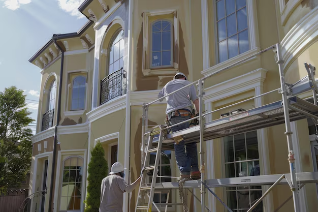
Dark colors reward good prep work. They show surface imperfections and fading more readily than mid-tone shades, so the quality of the substrate matters as much as the color itself. If siding, trim, or cladding needs repair, that work belongs before the first coat goes on, not after.
Front doors are where you can take a risk cheaply. A door painted in a saturated shade against a restrained facade gives a house personality without committing the whole elevation to it.
Interior Neutrals Hudson Valley Homeowners Keep Coming Back To
Local paint lists and designer picks overlap a lot, which tells you something about which neutrals genuinely perform here. Whites, greiges, and soft blues dominate for good reason: they work with older woodwork, modern drywall, and everything between.
| Palette direction | Color names appearing in Hudson Valley paint lists |
|---|---|
| Warm whites | White Dove, Swiss Coffee, Simply White, Alabaster |
| Crisp white | Chantilly Lace |
| Greige and soft gray | Perfect Greige, Balboa Mist, Silver Chain |
| Soft blues | First Light, Buxton Blue |
| Deep blue | Hale Navy |
| Earthy green | Muted sage green |
| Warm earth neutrals | Warm taupe, greige, soft beige, mushroom tones, sand-inspired neutrals, Natural Linen, Nomadic Desert |
Warm whites versus crisp whites
Warm whites carry a hint of yellow or cream and tend to soften a room with older trim and natural wood floors. Crisp whites read cleaner and brighter, which suits modern kitchens and open plans where you want walls to recede. Neither is better. The question is what the white is sitting next to.
Greige, taupe, and mushroom tones
These mid-tone neutrals are the workhorses of a whole-home palette. They cover wall imperfections better than pure white, they hold their color in low light, and they transition comfortably between living areas, hallways, and bedrooms. Pair a stable favorite like Balboa Mist with lighter companions such as First Light and Buxton Blue when you want a subtle shift between rooms rather than a hard break.
Adding Color Without Regret
A house painted entirely in one neutral can feel inert. The fix is not to flood every room with a bold hue, but to distribute color with intention. Hale Navy works in a den, a mudroom, or as cabinetry. A muted sage green brings the outdoors in and has a track record of holding up in local review processes, including approval in Rhinebeck, Hyde Park, and Cold Spring historic district commission reviews.
Keep trim, ceilings, and doors consistent throughout the house. Let wall color vary. That single rule prevents a well-chosen palette from turning into a collection of unrelated rooms.
Check Historic District and Association Rules First
Not every Hudson Valley home can be painted any color the owner likes. Some communities require historic district commission review before exterior color changes, and homeowners associations may apply their own approved lists. If your property sits inside a designated district or an association, confirm the requirements with the relevant office before you purchase paint, and bring your color chips with you to the review. Finding out after the fact is an expensive way to learn the rule.
Test Before You Commit to a Whole House
Sample first, always. Paint two coats on a large board or directly on the wall in the room you plan to paint, then live with it for several days. Look at it in morning light, at midday, and at night with the lamps on. Colors shift considerably depending on the light, and a shade that feels warm at noon can read gray after dark.
Compare samples side by side rather than one at a time. Isolation makes almost any neutral look correct. Move the samples around the room and view them against the floors, the countertops, and any stone or brick that will stay. Those fixed surfaces constrain the palette more than your furniture does.
Where to Buy Paint Around Hudson NY
River Tide Builders at 161 Oak Hill Rd, Hudson, NY 12534 is an authorized Benjamin Moore dealer. The store can be reached at , and stopping in to see colors in person under real lighting beats judging them on a screen. Williams Lumber and Home Centers has served as a home improvement source since 1946, and their guidance for Hudson Valley homeowners centers on choosing colors that support daily life and long-term comfort.
Fit Painting Into the Larger Renovation Schedule
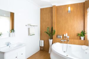
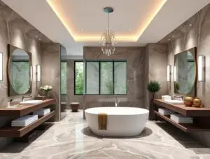
If paint is the last item on a longer project, the order of work matters. Drywall, trim carpentry, and any electrical or plumbing rough-in should be complete and inspected before walls get their final coat, because cutting in around finished paint later is how touch-ups multiply. On a kitchen or bathroom remodel, cabinet color and wall color are best chosen together so the two do not fight each other.
On a whole-home renovation or new build, paint selections are usually locked in several weeks before the painter arrives so that orders and samples are ready. Working with a builder who manages the full sequence, from framing and roofing through the finishing trades, keeps the color decisions attached to the schedule instead of holding it up.
The short version: study your light, respect the architecture, borrow from the neutrals that already work in this region, verify any district rules, and test before you buy. Do those five things and the color you choose will still look right long after the novelty wears off.
Frequently Asked Questions
How many paint colors should I use in one home?
Three to five colors is a comfortable range for most houses. Choose one wall neutral, one trim white, and one or two accent shades you can repeat from room to room. Keeping trim and ceilings consistent throughout is what makes individual room colors feel deliberate rather than random. More than that and the house starts to feel pieced together.
Should my Hudson Valley exterior be light or dark?
Both directions work here. Deep red, rich blue, charcoal gray, and classic black are popular choices in the Hudson Valley that give a home a distinctive look. Homes with red or brown masonry tend to suit colors that complement the brick, while Cape style houses look balanced with soft, understated hues. Consider how much sun the facade receives.
Do I need approval before painting my house exterior?
It depends on where you live. Some Hudson Valley communities require historic district commission review before exterior color changes, and muted sage green has increasingly been approved in Rhinebeck, Hyde Park, and Cold Spring review processes. If your home sits in a designated district or belongs to a homeowners association, confirm the rules with the relevant office before buying paint.
Where can I buy Benjamin Moore paint near Hudson NY?
River Tide Builders at 161 Oak Hill Rd, Hudson, NY 12534 is an authorized Benjamin Moore dealer. You can call or stop by the store. Seeing colors in person under real daylight, rather than on a phone or monitor, is the most reliable way to judge how a shade will actually look.
How do I test a paint color before committing?
Paint large sample boards or paint directly on the wall in two coats, then live with the color for several days. Check it in morning light, midday, and after dark with the lamps on. Colors shift dramatically with lighting, so a shade that looks warm at noon can read gray at night. Label each sample.